

 |
| old logo |
the lettering is the same shape, but more flat and polished.
 | |
| new menu |
 | |
| old menu |
compared to the old menu look, the new menu style looks much more polished, and less garishly blue. also the logo in the side of the window has changed to a more basic one, the lettering being overlaid on the blue background directly. And to top things off, the status area actually shows something.

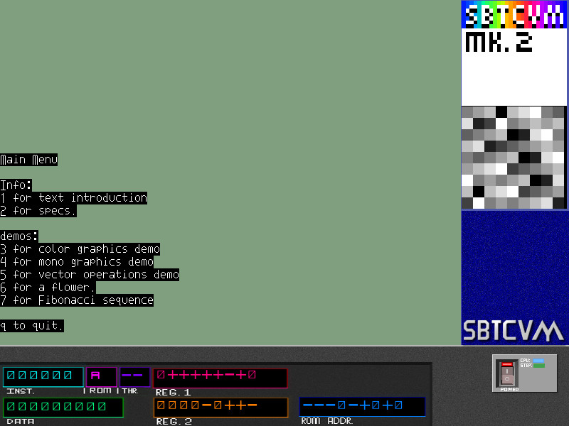
you might notice the new thread ID display as well.
No comments:
Post a Comment